Coloring comics with traditional materials
For the past couple months, I’ve been working on a one-shot comic book with my friend John. He wrote the script, originally planned for a short film, and I’m in the (long) process of adapting it into a comic book instead, with a planned 28 pages.
Since this is the first time I’ve ever tried to make a full comic book, as opposed to a zine with comics-like illustrations (such as this one or this one), there are a lot of things I find myself trying to figure out as I move along. It’s a learning process. For anyone interested in illustration or practicing the basics of structure, form, light, and, depending on the approach, color, I can’t recommend making comics enough. It forces you to do all these things together, over and over, and to try to do so with some amount of consistency. Suffice to say that this stuff is hard, so it’s also been taking me a long time to work through.
In my process of trying to learn the things that I realize I don’t know, I run a lot of Youtube and Google searches for process videos, blog posts, and forum discussions. Sometimes this is more a matter of procrastinating (funny, this way of putting off my hobby that I already use to put off my “real” work). And while there’s an entire universe of information out there related to the work of making comics, some of which has been incredibly helpful, I often have particular curiosities about using particular materials in particular ways. In those cases, there’s often nothing out there tailored specifically enough to my curiosity. I’ll dig and dig, even though I know that the best way to figure it out would be just to experiment myself. The mind works in mysterious ways: I’ll keep looking for someone else’s approach, even though taking a stab at it myself and just playing around is both more fun and more illuminating.
So anyway, one thing I’ve run many searches on is different approaches to coloring comics with traditional materials. There’s stuff out there on the way DC and Marvel colorists used various CMYK dye recipes back in the day to produce the classic faded newsprint colors of the golden age comics. There’s also stuff out there about painting comics with transparent watercolor over inks, directly on the page. Then, of course, there’s lots of tutorials on how to color comics digitally.
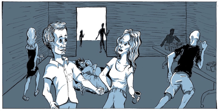
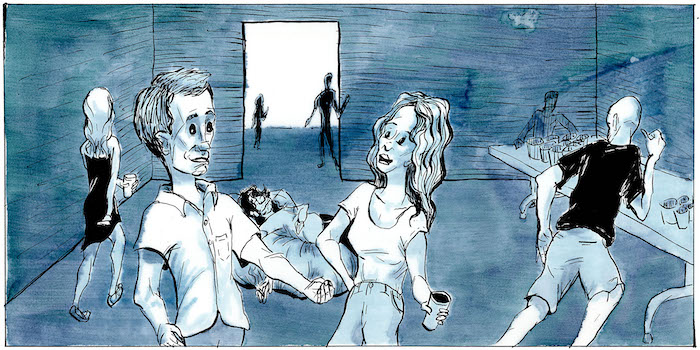
When I began coloring this comic book, I did it digital in Photoshop, separating my black inks from the blue-line sketch originally done on bristol board and laying flat colors beneath the ink lines. I completed three pages coloring this way, having spent many hours doing so. Here’s the first panel of the first page, colored with digital flat colors:
While I liked, for the most part, the color scheme I landed on of almost monochromatic muted cyan and some accents of an ochre yellow, I got increasingly frustrated with my attempts to render in flat colors, especially on the subsequent couple of pages. In general, I prefer flat colors to anything that involves gradients when done digitally. Honestly, I can’t stand the airbrushed, many-colored look of contemporary DC and Marvel comics. But when done right, flat colored comics look very nice. The problem is, you have to have a deep understanding of how light and shadow falls across form, as well as strong intuitions about composition, in order to do it right. I’m just not there yet.
So what I needed was a way of coloring that is both more forgiving of sloppy approaches and looks more interesting visually, even when done in muted monochromatic colors. This has been my M.O. for a lot of my drawing/painting process in general. I like using a loose hand with materials that lend themselves to “happy accidents,” but this chaos has to be controlled enough to communicate its images, especially in the world of comics, where communication and storytelling is probably more important than aesthetic appeal. And beyond all these things, quite frankly, I’ve just been missing painting. Sitting with the materials—with wet colors on different kinds of paper, using brushes and pens—is what holds so much appeal to me about this hobby. I get away from the screen, and I shift my mental space from the textual and conceptual to the way liquid runs on cotton or wood pulp and how colors and values create illusions of form on a flat plane. This has been the saving grace of my grad school stress, to be able to change the channel on my mind in this way.
But moreover, this challenge of selecting coloring materials was further complicated by the way I’ve been doing my inks on top of blue-line sketches. It’s sort of an old-school approach: using bristol board pages with blue-printed guidelines for page trim and panel divisions, sketching out the drawing with a blue colored pencil, and then inking with a dip pen and brush directly on top of that blue pencil sketch. To convert to black and white, I scan the page in and eliminate the blue color in photoshop, while also adjusting the levels to remove gray middle-tones as much as seems right in context.
So, one way of coloring traditionally would just be to use transparent watercolors directly on top of the inked page. But this would mean either leaving the blue lines in the image or eliminating the blue lines again, thus also eliminating any cyan tones in the colors. A problem, when the vast majority of the colors in this book are shades of cyan.
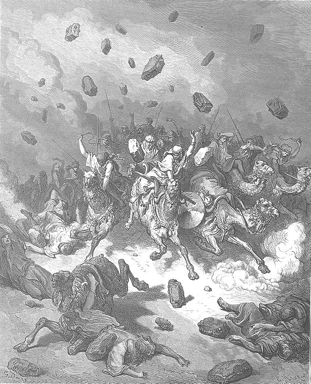
I needed a way of coloring that could happen over the inks on a separate sheet of paper or film, which would then be scanned and layered beneath the ink lines in photoshop. Fortunately, there are types of translucent drafting film that would allow me to do this. I’m thinking that Dura-Lar by the company Grafix will be my best bet for quality+budget (I’ll be going through a lot of sheets), so I ordered some. Meanwhile, I did some tests on a similar product called Denril, by the company Borden & Riley, which I happened to have a pad of here at home. (I am a junkie when it comes to buying art supplies, and I am drowning in varieties of paper and ink.) I’ve used this Denril drafting vellum once before for an illustration/blog project I did a while back, which took a visual-essay approach to the role of terror in evangelical Christian readings of the biblical book of Joshua. For a part of that project, I copied a Gustav Doré etching of a scene from the book. Here’s the Doré original:
And here’s my version:
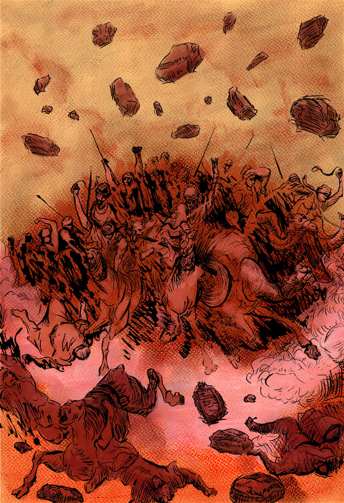
I used dry pastel to on a colored paper to set out some colors and values and then layed the Denril vellum on top to do the inks. The vellum let me see the tonal shapes I had made beneath so that my inks were in the right places. I then scanned both pages, layered the black inks on top of the pastel background, and did a little further coloring in Photoshop. One thing I learned in that process was to beware of setting my hand on the vellum! You may notice a patch that looks a bit grayer than the rest, and that’s because the ink was reacting to the hydrophobic oils from my hand.
For my current project, I would need to do the reverse of what I had done in the Doré copy. I already had the inks on paper, but I needed to color on top of them and then layer that color beneath the ink on my computer. First, I tried using gouache directly on the Denril vellum. Gouache comes from a tube and works just like watercolor, except that it is opaque, whereas watercolor is transparent. Gouache or similar materials, such as “poster colors,” are what was often used to make those amazing background paintings in classic animations and the Studio Ghibli movies. It’s a really fun medium to work in, and one of the ones I use most frequently. Here’s that attempt:
A couple issues: first, the brush I was using was too small, making that streaky effect, which was exacerbated by the smooth, non-porous surface of the vellum that caused the gouache to pool slightly (though not as badly as I thought it would). That issue could be solved by using a bigger brush and less water. However, the bigger issue is that gouache, being opaque, totally obscured the ink lines once it was layed down. I couldn’t see my shapes! So, I needed to use something transparent but that could adhere to the non-absorbent drafting vellum. Plus, I like the luminosity and texture of transparent colors under inks, allowing the light the pass through and reflect back off the white page underneath before it meets your eye. The inks then kind of function like a flat black mask, while the negative space has the interesting texture.
So, my solution was to prepare the slick drafting vellum with a thin coat of clear gesso. Gesso is a paint- or glue-like substance, mixed with chalk dust, that is very frequently used as a “ground” to prepare a surface for painting on. It provides a barrier between the paint and the surface, which is especially necessary when using something like oil paints, because it stops the oils from getting leached into the absorbent substrate. Because of the chalk content, gesso also provides a very nice surface texture to paint on. This is particularly the case with the Liquitex clear gesso I’m using, which has an especially “gritty” texture, even compared to the opaque white gesso by the same brand. I’ve come to love this texture, more so because I can build in further wildness with the brush strokes I use to lay it down. I’m thinking that this could make for some neat textural choices on some of the comics pages when appropriate.
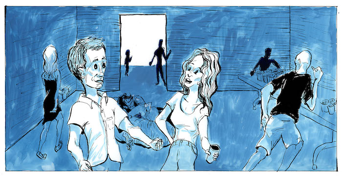
So, I coated the vellum in Liquitex gesso and used, for this, Ecoline liquid watercolors, particularly the Indigo color, which goes down as a deep muted cyan and dries a bit more greenish. Using the liquid watercolors rather than tubes or cakes allows me to better control my dilutions, which may be necessary to create consistency across the different pages. Here is the first panel test for this approach:
I’m liking how this has come out. It’s a reminder that traditional materials can lend themselves to the kind of mild surface chaos I enjoy in illustrations. I think it will also allow to me to make more mistakes with the inking and design, because the surface will still look interesting. The challenge will be to keep the images communicating through that semi-controlled chaos, without letting the dynamics of the texture distract from the story that the shapes should make.